SR520 UI Kit
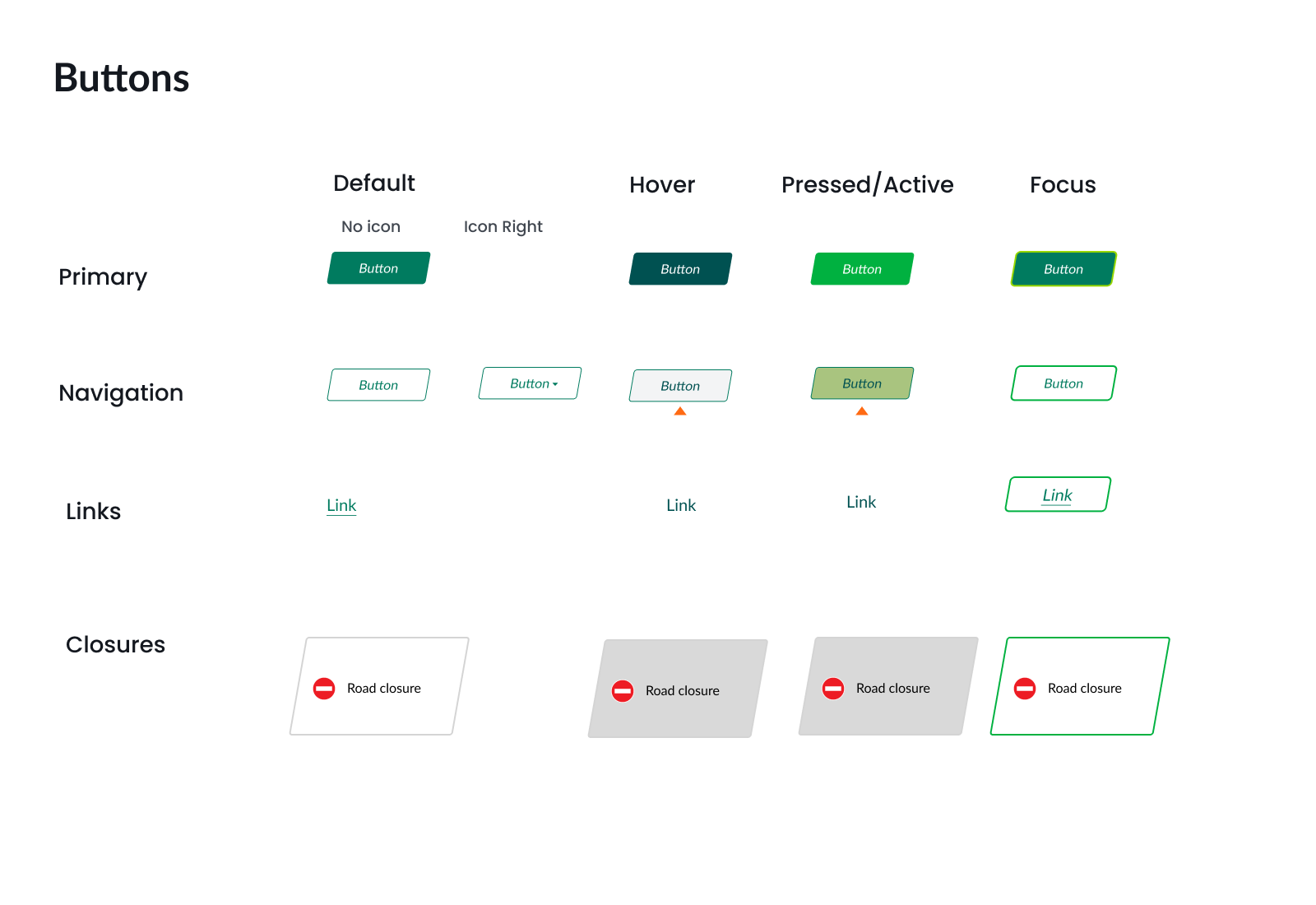
A comprehensive UI kit containing essential design elements including typography, buttons, icons, logos, and a color palette to ensure a cohesive and visually appealing user experience.
Role
Design
DevelopmentProject Management
Tools
FigmaIllustrator
Technologies
cssBootstrapJavascript
Transforming Chaos
Background: I initiated a transformative overhaul of the SR520 Bridge Project website's user interface (UI) to address its disorganized state and elevate its overall design standards. Recognizing the need for a cohesive and visually appealing user experience, I took the lead in creating a comprehensive UI kit that encompassed typography, button design, colors, and logos. The project's background stemmed from a desire to establish a sense of identity and professionalism while streamlining the design process.
Goal: By initiating this endeavor, I aimed to enhance the website's usability, visual consistency, and overall aesthetic appeal, contributing significantly to the project's success and positive user experience.
Visual Identity
The colors and logos used in the SR520 Bridge Project website were derived from the Washington State Department of Transportation's (WSDOT) brand guidelines, ensuring alignment with established branding principles. By adhering to these guidelines, I ensured a consistent and cohesive visual identity that resonated with WSDOT's overarching brand while maintaining the project's unique identity.
The color palette was selected from WSDOT's approved colors, which are not only visually appealing but also carry specific connotations related to trust, reliability, and environmental consciousness—values synonymous with both WSDOT and the SR520 Bridge Project. This choice not only ensured brand consistency but also established an immediate connection with users familiar with WSDOT's brand.
Overall, leveraging WSDOT's brand guidelines allowed me to create a visually cohesive and impactful UI kit that not only met the project's design requirements but also aligned seamlessly with broader organizational branding strategies, reinforcing trust and credibility among users.
Summary
Through the creation of a UI kit that incorporated typography, buttons, colors, icons, and logos, the project achieved a cohesive and professional visual identity. By aligning with the Washington State Department of Transportation's (WSDOT) brand guidelines for colors and logos, the redesigned UI maintained consistency and credibility while conveying the project's mission and values effectively. The resulting website not only improved usability and navigation but also established a strong brand presence, contributing to a positive and memorable experience for visitors.


